Many of the next tier of tech companies are far more expensive than the Magnificent Seven
NBR Articles, published 16 June 2026
This article, by Te Ahumairangi Chief Investment Officer Nicholas Bagnall,
originally appeared in the NBR on 16 June 2026.
Many people who comment on how expensive the US market is like to single out the magnificent 7 (Nvidia, Apple, Alphabet, Microsoft, Amazon, Meta, and Tesla) as being particularly expensive. While I share this perception with respect to the ridiculous valuation of Tesla (see our January 2025 insight article https://teahumairangi.co.nz/research-and-commentary/tesla-is/on this topic), I don’t think that the other members of the magnificent seven are quite as expensive as many of the “next tier” of tech companies, with market capitalisations of between US$75 billion and US$1 trillion.
In the graph below, I show the P/E (price-to-earnings) multiples of all members of the MSCI World Information Technology index with market capitalisations of over US$75 billion. I have also included: the three largest emerging market information technology companies (Taiwan Semiconductor Manufacturing Company (“TSMC”), Samsung Electronics, and SK Hynix); 3 large US tech-related companies that are classified as fitting into sectors other than the Information Technology index (Alphabet, Amazon.com, and Meta Platforms); and ARM Holdings (which is not a member of the MSCI World index, despite having a market capitalisation of over US$400 billion).
For this graph, I have used a blended earnings metric, taking an average of earnings per share over the past 12 months and forecast earnings per share for the next 12 months (based on Bloomberg’s survey of sell-side analyst forecasts).
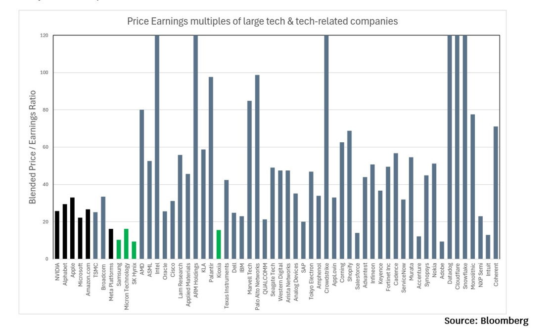
The graph orders companies from the largest market capitalisations on the left, through to the lowest market capitalisation on the right. The 11 left-most companies on the graph have market capitalisations of over US$1 trillion. The 10 right-most companies on the graph are at the smaller end, with market capitalisations of between US$75 billion and US$100 billion.
I have coloured the bars for the magnificent seven companies in black, and have coloured the bars for 4 memory chip companies in green.
The key point that this graph demonstrates to me is that there are a lot of “next tier” technology companies trading on particularly high price/earnings multiples. While every company shown on this graph with a market cap of above US$1 trillion is valued on a P/E multiple of less than 34, the median P/E multiple for the 47 “next tier tech companies” shown on the graph is a whopping 47.5 times annual earnings.
There are only a handful of tech companies with market caps of between US$75 billion and US$1.4 trillion that aren’t trading on rich P/E multiples. Many of these companies fall into a few out-of-favour categories. They’re either: memory chip companies (Samsung, Micron, SK Hynix, Kioxia) where the market anticipates that strong pricing of memory chips will only last a few years; software companies that are perceived as being threatened by AI (Adobe, Intuit, Salesforce, SAP); or companies that have missed out on the arbitrary share price boost from being included in the Nasdaq-100 index (Oracle, IBM, Salesforce, Accenture, Dell, and most of the non-US companies).
Incidentally, most of the other US companies shown in the graph are members of the Nasdaq-100 index, which seems to be an incredibly popular benchmark for ETFs and other passive investment vehicles, despite this arbitrarily-determined benchmark making absolutely no sense from the perspective of academic logic that supports passive investing. Recently, Nasdaq changed the rules for inclusion in this index to allow SpaceX to be fast-tracked into this benchmark, for the apparent reason that Nasdaq wanted to win the SpaceX listing ahead of the New York Stock Exchange. People who choose to invest in ETFs and other vehicles benchmarked to the Nasdaq-100 are therefore now choosing a benchmark that determines its eligibility rules based on the index publishers’ business interests rather than investors’ interests. Furthermore, the rules for the Nasdaq 100 index limit what proportion may be invested in the largest constituents, which has the effect of reducing how much Nasdaq-100 money flows into the Mag-7 and instead it re-directs much of this money into the next tier technology companies that are the subject of this column.
It could be argued that in deciding which companies to include in the graph, I’ve screwed the scrum to make the mega-caps look reasonably priced by not including the two most expensive trillion-dollar-plus tech-related companies, being the newly listed SpaceX (with a valuation of US$2.1 trillion, even though it is expected to lose money this year) and Tesla (with a market valuation of over US$1.5 trillion even though it has only made about US$0.004 trillion of profits over the past year). In part, I’ve excluded these companies because the current sources of these companies’ profits is not really information technology (hence their non-inclusion in the MSCI Information Technology index), but it is also because I consider that most people “investing” in these companies at current valuations are essentially practicing an odd form of religion rather than rational investment. Similarly, I have excluded the other non-income-producing trillion-dollar-plus religious icon, Bitcoin (with a capitalisation of US$1.3 trillion).
Why look at Price / Earnings Multiples?
Fans of growth investing often like to disregard P/E ratios, arguing that they aren’t particularly helpful at predicting future returns. While valuation indicators such as P/E multiples have a mixed track record over time for picking winners, they do work far more consistently when used to avoid losers. In the graph below, I compare the returns you would have got over time from investing in stocks that either: (1) don’t have any reported positive earnings (normally because they’re losing money, but in some cases because they’ve only just listed); or (2) trade on the highest P/E ratios (calculated using reported earnings); against (3) the universe of all stocks in the MSCI USA index.
As can be seen, stocks that were relatively expensive either because they didn’t have any reported earnings or because they traded on a relatively high multiple of earnings have lagged the broader market over time.
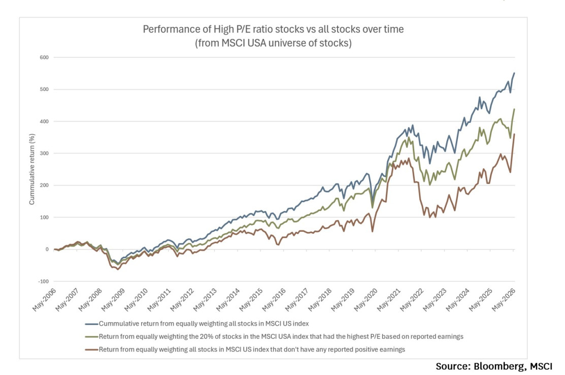
Proponents of growth investing may take heart from the fact that high P/E stocks did not lag the broader universe by much for the first few years shown in the graph. However, such complacency would be misplaced, as “expensive” in the first few years of this graph meant quite a different thing to what it does today. In May 2006 (at the start of this graph) a stock only had to have a P/E multiple of 26.7 to qualify as being in the most expensive quintile of stocks. This bar for being counted as expensive dropped to a P/E multiple of just 14.8 during the depths of the Global Financial Crisis (February 2009). But today, after many years of rising markets and investors chasing growth, a company now needs to trade on a P/E multiple of over 39.6 (using trailing 12 month earnings) to be counted as belonging to the most expensive quintile of the US share market.
As we saw from the first graph, many next tier tech companies meet this dubious grade. Many of the people buying shares in these companies are fresh-faced fund managers or novice retail investors who have no experience of investing in a world where a company trading on 20 times trailing earnings would be regarded as relatively expensive. Without this prior experience, they often fail to appreciate the potential downside from buying a stock on a P/E multiple of more than 47.5 times earnings.
It is important to acknowledge that P/E multiples of 47.5 or more could be justified in some circumstances (particularly if a company has enough future growth in front of it), so it does not automatically follow that every company on this graph with a P/E of over 47.5 must be a bad investment. However, it seems very unlikely that such a high proportion of large tech companies could all have such fantastic growth outlooks that they all deserve such high valuations.
If only two or three of the 47 next tier companies shown on the first graph were trading on P/E multiples of over 47.5 while the remaining companies were trading on more reasonable P/E multiples (e.g. under 35), then a reasonable interpretation would be that perhaps we’re looking at an efficient market that has identified the two or three companies that have a strong prospect of achieving particularly spectacular growth over the next decade. But when half of the companies in this sample are being valued on P/E multiples of over 47.5, we should be wary about accepting efficient market explanations for these valuations, and instead consider the possibility that the weight of money and/or unrealistic expectations have driven up the market prices of these companies as a group.
To further explore whether superior growth rates could potentially justify the premium P/E multiples that many of the next tier tech companies are trading at, the following graph shows the growth rates that each company is achieving. The growth rate shown in the graph blends the growth rate that each company has achieved over the past year with the growth rate it is expected to achieve over the next year.
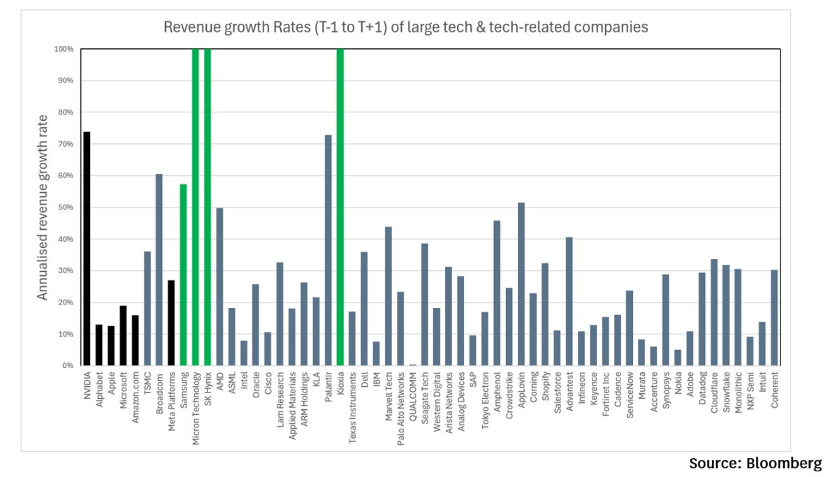
One thing that the colour coding should make clear is that memory chip companies are currently achieving far faster growth rates than other companies, due to a spike up in the market price of memory chips. Three of the four memory chip companies are growing faster than any other company on the graph, and the other memory chip company (Samsung Electronics) is “only” growing at 57% because it does a lot of other things in addition to being the world’s largest vendor of memory chips (such as selling mobile phones), which dilutes its overall growth rate. We saw in the first graph that the memory chip companies are trading on lower P/E multiples than almost any other company on the graph. The market is essentially taking a view that (in common with historical periods when memory pricing shot up) the boom in memory pricing will only be short-lived, such that current level of earnings from these companies is unlikely to be sustained.
Many of the other companies showing strong revenue growth in the graph above are (like the memory chip companies) benefitting from the building boom in data centres & AI. But unlike the memory chip companies, the market doesn’t seem to believe that the boom will be temporary for these non-memory AI-beneficiaries. None of these non-memory companies are currently achieving growth rates as high as Nvidia’s, but 77% of the sub-US$1 trillion companies included in the graph are trading on higher P/E multiples than Nvidia.
Arguably, Nvidia’s P/E multiple builds in at least some prospect that the AI capex boom won’t last forever, but this modicum of caution is not so evident in the valuations of companies like AMD, Intel, LAM Research, Marvell Technology, and Monolithic Power Systems, all of which are priced as if they’ll see a lot more growth than Nvidia in the future (even though they’ve lagged Nvidia to date).
Advanced Micro Devices (AMD)’s share price seems particularly out of touch with reality. When the AI boom began with the release of ChatGPT, AMD had looked like a clear beneficiary, given that it was then the only competitor to Nvidia participating in the GPU market. However, to date it has failed to maintain its share of the AI boom, with its data centre business “only” growing 57% over the past year whilst Nvidia’s data centre business has grown 92% and Broadcom’s equivalent division has grown 98%. Yet despite this, the share market has lifted AMD’s share price by more than 150% in the first 11 weeks of the current quarter, such that the business is now being valued at more than 160 times trailing earnings.
The next tier of Information Technology companies seems particularly risky!
It is instructive to look at what the share price behaviour of different companies says about the confidence we can have in their future outlook. The graph below shows the share price volatilities of each of these companies over the past year. Volatility represents that annualised standard deviation of daily returns from each company (over the past year). The median volatility for companies in this graph with market caps of less than US$1 trillion is currently over 50%.
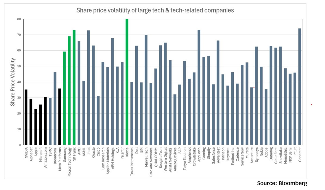
This volatility is extremely high – if you try to reconcile a share price volatility of over 50% with an efficient market perspective, then the only reasonable conclusion would be that each of these companies is essentially a “hero or zero” crapshoot. Assuming an expected return of 8% per annum, a random walk with 50%+ volatility is analogous to tossing a coin each year to find out whether your investment has gone up in value by 58% or down in value by 42%. The mathematical expected return for each year is +8% (the average of -42% and +58%), but the most likely outcome after a decade will be that you will have rolled 5 heads and 5 tails and will have lost 35.4% of your money, because each 58% gain is insufficient to recover from a 42% loss. If you get ten heads in a row then in theory this game could see the value of your investment grow by almost 100 times, but the probability of this is less than 1 in 1000. If you get only 4 heads (a 20.5% probability), you’d lose more than 75% of your money, and if you get 3 heads or less (a 17% probability) you’ll lose more than 90% of your money. The fact that so many next tier tech companies are showing this level of share price volatility is a clear sign that few people buying and selling shares in these companies have any clear idea about what they’re really worth.
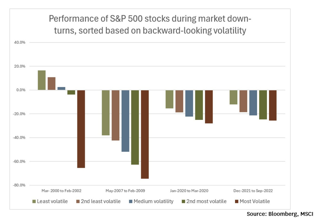
History shows that when the market falls, the most volatile share prices invariably fall by the most. In the graph below, I show how S&P 500 stocks ordered into different buckets of volatility have performed during each of the last 4 significant market down-turns. In each case, the most volatile stocks performed the worst.
In contrast to the highly volatile share prices of the next tier tech companies, the magnificent seven companies (other than Tesla) show share price volatilities more in the order of about 30%. This sort of volatility is more “middle of the pack” and indicates that investors in these companies have a broad sense of what they’re worth.
Conclusions
As a group, the next tier of Information Technology companies (companies with market capitalisations of between US$75 billion and US$1 trillion) look very expensive. The majority of them are trading on price earnings multiples that would only make sense for exceptional companies with exceptionally good growth prospects. It seems highly improbable that the majority of these companies have exceptionally good growth prospects, so trying to identify the two or three companies amongst the group that are likely to achieve sufficient growth to justify their valuation seems fraught with risk. The volatility of share prices within the group and the fact that many of the fastest growing companies within the group are riding a capital spending boom that may not persist indefinitely further supports the view that investing in these companies carries an unusually high level of risk.
Nicholas Bagnall is Chief Investment Officer at Te Ahumairangi Investment Management.
Disclaimer: This article is for informational purposes only and is not, nor should be construed as, investment advice for any person. The writer is a director and shareholder of Te Ahumairangi Investment Management Limited and an investor in Te Ahumairangi Global Equity Fund. Te Ahumairangi manages client portfolios (including Te Ahumairangi Global Equity Fund) that invest in global equity markets, and hold shares in companies mentioned in this article, including Nvidia, Apple, Alphabet, Microsoft, Amazon, Meta, Broadcom, Taiwan Semiconductor, Samsung Electronics, Adobe, Oracle, IBM, and Accenture.